A few weeks back I stumbled upon this tweet in a thread about the accuracy — or lack thereof — of the Foobot air quality meter:
[Image no longer available]
The statement has stayed with me since, and I believe the answer is not quite so simple. In fact I’ve come to the conclusion that the opposite is true: Wrong data is better than no data — as long as you know how accurate the data is.
Given that important qualification, wrong data is only worse than no data if it is completely wrong.
As always with data, you have to know what you are looking at. From definitions of terms in the data set to how accurate you can expect it to be.
And this is important. Data is hardly ever 100% correct. The definition of “correct” is not even straight forward, and highly depends on the domain and context.
Using the example from Alan’s tweet: Having an altitude meter that you know shows your altitude within — say — 100 ft is a lot better than having no altitude meter at all.
Let’s take world population as another example. We know for a fact that a gimmicky (but well founded) counter like this one:
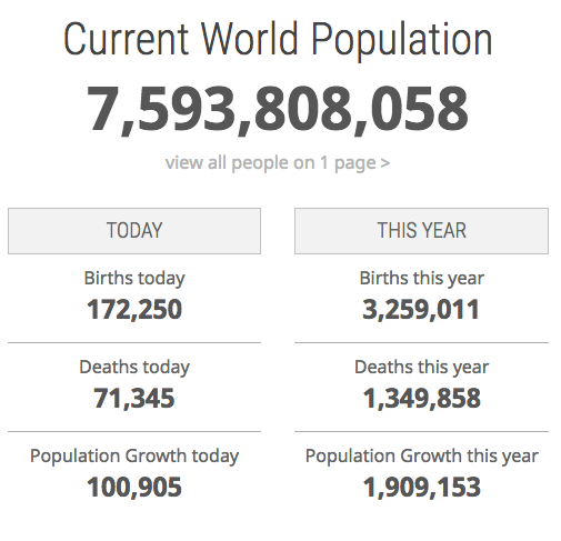
…is not 100% correct. But the order of magnitude certainly is. According to best estimates — the 2017 revision of the UN’s World Population Prospects (on which the above counter is in fact based)— it would be fairly safe to use two significant digits and say that there are currently 7.6 billion people in the world. In other words: The data in the counter is clearly better than no data, even though it is also most definitely “wrong” at the 10 significant digits it shows.
The final example comes from my Fitbit Aria scale whose accuracy can easily be questioned as readings in immediate succession can vary several tenths of a kilogram. However, if I see a long term change or a clear rolling average trend, I know these are real changes. With something like body weight, which can vary a few percent over longer periods based on how much water your body is retaining, and easily another percentage or two within a single day based on how much and how recently you’ve drunk, eaten and — erhem — gone to the bathroom, point-in-time accuracy is not that important. Again: At the 3–4 significant digits that the Aria reports, the data is almost definitely “wrong”, but the margin of error is only a few hundred grams, so it’s clearly better than no data, especially when averaged over time.
I have no idea how good the Foobot air quality meter is, and the examples in the first tweet in the thread above certainly seem to indicate a failure greater than a mere margin of error. But regardless Foobot seems to fall into the same pitfall as too many other data products: Presenting numbers with great accuracy without communicating an expected margin of error. This in turn leads to users’ distrust when they see inconsistent measurements, even when they are within the margin of error expected by at least the engineers of the product.
How to visualize uncertainty is still one of the hard problems of data visualization, but ignoring the problem and suggesting accuracy beyond what is realistic deteriorates the trust in the data and in your product.
As for the original question of whether wrong data is worse than no data at all, Hans Rosling — as so often — said it best:
Data is often better than you think. Many people say [certain] data is bad. There is an uncertainty margin, but we can see the difference […] The differences are much bigger than the weakness of the data. — Hans Rosling: The best statistics you’ve ever seen (10:49)