For a while, I’ve been on the hunt for what might qualify as the first computer data visualization.
Partly I’m looking for raw material for something similar to what I did with the “History of data tables”, but this also feels like an important piece of data visualization and analytics history that should be captured.
Likely candidates have been curiously hard to track down. I suspect that one of the reasons is that many early attempts have not been preserved in any format. They’ve been temporary blimps on monitors or — more likely — lightbulb arrays or even analog gauges controlled be computers to display a quantity or outcome from a calculation.
That last example also shows that definitions matter. What exactly qualifies as a “computer visualization”?
For the purposes of this exercise, I’ve decided that the output, in form of an image or diagram, has to be computer generated. That disqualifies analog gauges and lightbulb arrays, and indicates that the earliest forms might be found in print-outs from the days of paper-based terminals.
For visualizations in general, many of the earliest examples are simple maps, first of the stars of the sky and then of the land:
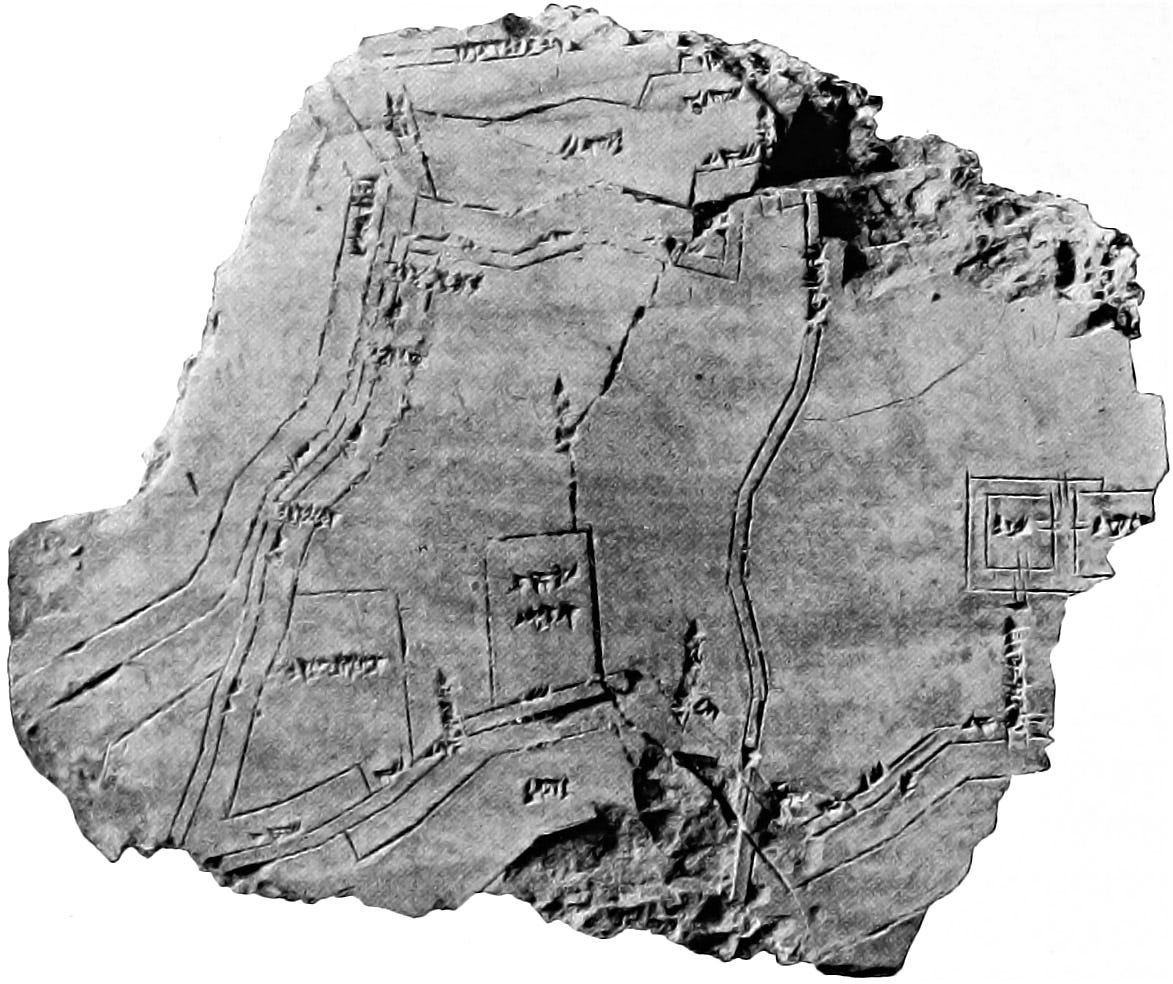 Clay tablet containing city map of Nippur, Babylonia (ca. 1400 BC)
Visualizations of quantitative data come a lot later. This drawing is by many believed to be the first:
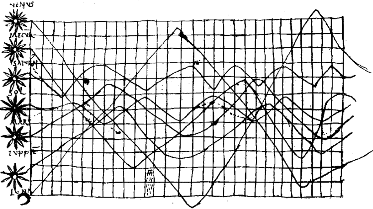 A 10th century visualization showing the relative positions of the most visible celestial bodies over time
The progression:
- From drawing the arrangement of the stars in the night sky…
- …to maps of immediate surroundings…
- …to a truly quantitative visualization…
…is not surprising as they represent progressive layers of abstraction: from something observed directly, to a scale representation of observed reality, to a purely abstract representation of an observed phenomenon.
But when it comes to the early days of computers, such abstract thinking was obviously well established, hand-drawn visualizations were already a respected medium, and maps are in many ways significantly harder to produce using the output media of the time than something like e.g. a bar chart.
I was therefore surprised when I found — through this massive list![]() of significant milestones in visualization — a computer-generated map that significantly pre-dated my previous candidates: A 1963–65 (?) map of the state of Connecticut, generated using MIT’s Howard Fisher’s SYMAP software:
of significant milestones in visualization — a computer-generated map that significantly pre-dated my previous candidates: A 1963–65 (?) map of the state of Connecticut, generated using MIT’s Howard Fisher’s SYMAP software:
 The earliest (surviving) computer visualization?
I am convinced that I will eventually find a simpler computer generated chart — most likely a bar chart made with character symbols (like people do to this date) — that predates this one. But for now I jot this down as (potentially) the earliest preserved computer visualization in history.
If you are aware of other old and noteworthy computer visualizations, comment below or Tweet me @hjalli