A few weeks ago I wrote about what might be the first computer data visualization.
Today I came across a post from spreadsheet veteran Charley Kyd where he makes a credible claim for having created the first dashboard report, or “Mini Graph Management Report” as he called it back then. He dates his first experiments with the format to the early 80’s, but the image below is from his 1986 textbook, Financial Modeling Using Lotus 1–2–3.
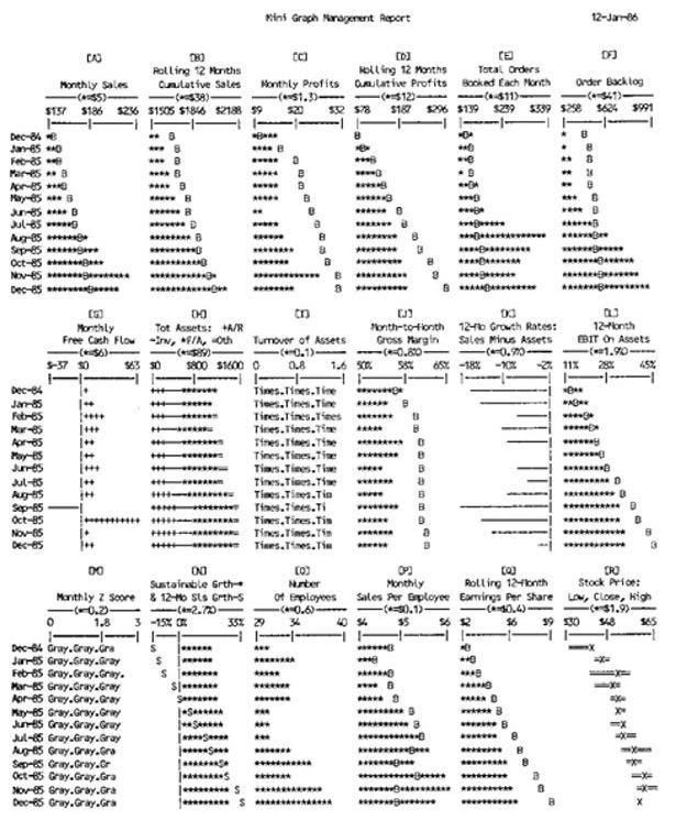 The first computer generated data dashboard?
These are obviously ASCII graphics, but what is fascinating about them is that the chart “bars” are generated using built-in formulas (equivalent to Excel’s REPT, LEFT and REPLACE) and calculated from real values in the spreadsheet so they will update when the values are changed, making this — in essence — a “live” dashboard. Kudos Charley!
Pretty neat piece of analytics history right there :)
—
P.S. If anyone is aware of earlier examples of digital dashboards, visualizations, or has pointers to other interesting early examples of digital data or analytics examples, please tweet at me @hjalli